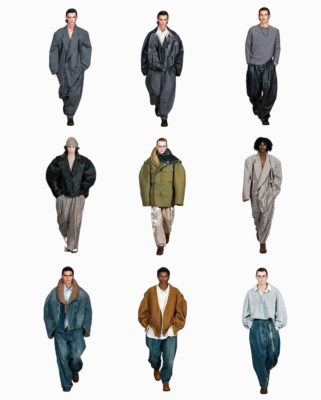
3D CSS Box
A simple 3D box component with "CSS-only" 3D transforms.
Artwork inspiration from Ignite Amsterdam
Credits
The component is derived from the Box chapter of David De Sandro's extremely awesome Intro to CSS 3D transforms tutorial.
Ported to Framer by Framer University
Installation
1pnpm dlx shadcn add @fancy/3d-css-box
Usage
The component renders a fully-featured 3D cube. Pass width, height, depth and optionally six React nodes for the faces. You may also grab the cube with a ref for programmatic control.
High-level cube example
1import { useRef } from "react"2import CSSBox, { CSSBoxRef } from "@/components/blocks/css-box"34export default function CubeExample() {5 const cubeRef = useRef<CSSBoxRef>(null)67 return (8 <>9 <CSSBox10 ref={cubeRef}11 width={220}12 height={220}13 depth={220}14 perspective={800}15 draggable16 faces={{17 front: <img src="/images/front.png" alt="Front" />,18 back: <img src="/images/back.png" alt="Back" />,19 left: <img src="/images/left.png" alt="Left" />,20 right: <img src="/images/right.png" alt="Right" />,21 top: <img src="/images/top.png" alt="Top" />,22 bottom: <img src="/images/bottom.png" alt="Bottom" />,23 }}24 />2526 <Button onClick={() => cubeRef.current?.showTop()}>27 Show Top28 </Button>29 </>30 )31}
Understanding the component
Before you dive into it, I highly recommend reading Intro to CSS 3D transforms by David DeSandro. It's a really great resource for understanding the basics, and this component is essentially just a react & tailwind port of the Box chapter.
Face layout
As you know, a box is a 3D object that has six faces. Each face is an absolutely-positioned <div> that lives in the same 3D context (transform-style: preserve-3d).
We pre-rotate every face so that their local +Z axis points outward and then translate it by half of the appropriate dimension:
Face layout
1rotateY( 0deg) translateZ(depth / 2) → front2rotateY(180deg) translateZ(depth / 2) → back3rotateY( 90deg) translateZ(width / 2) → right4rotateY(-90deg) translateZ(width / 2) → left5rotateX( 90deg) translateZ(height/ 2) → top6rotateX(-90deg) translateZ(height/ 2) → bottom
Rotation mechanics
- Two motion values
baseRotateXandbaseRotateYhold the raw rotation in degrees. - They are piped through
useSpringso they feel springy and configurable (stiffness,damping). See Motion – useSpring for more details. - We combine them into a single CSS transform:
Rotation mechanics
1const transform = useTransform([springX, springY], ([x, y]) =>2 `translateZ(-${depth / 2}px) rotateX(${x}deg) rotateY(${y}deg)`3)
Drag interaction
The box can be rotated through mouse drags or touch input. 3D rotation can be a nasty thing, especially when dealing with Gimbal Lock. While the almighty, super complex quaternions could prevent this issue (Three.js provides great utilities for that), implementing them felt like overkill here - at that point, the entire box might as well be rendered in Three.js.
The current approach maps mouse/touch movement directly to rotation around the X and Y axes. The implementation is pretty intuitive, while the actual feel of it can be sometimes unintuitive. Apologies for my laziness here.
When draggable is enabled, pointer movement gets translated into smooth rotational changes:
Mouse movement to rotation
1Δx → rotateY2Δy → rotateX
We do this by subscribing to mousemove and touchmove events and projecting the movement to rotation deltas. During dragging the spring’s stiffness is temporarily halved to give a slightly “looser” feel.
Drag interaction
1baseRotateX.set(startRotation.current.x - deltaY / 2)2baseRotateY.set(startRotation.current.y + deltaX / 2)
Modify that value to adjust the sensitivity of the drag.
Imperative API
Via ref you can trigger the following methods:
showFront | showBack | showLeft | showRight | showTop | showBottomrotateTo(x: number, y: number)– set exact anglesgetCurrentRotation()– read the live values
This can be handy for syncing cube state to a carousel or step-based walkthrough. For example, you can trigger a cube rotation with hover:
Or, tie the rotation to a scroll progress:
Notes
As it was pointed out above, implementing a similar component in Three.js would have been a lot easier and would give you much more flexibility and overall control over the rotation. You are still welcomed to use this component if you'd like to skip installing Three.js for whatever reason :).
Resources
- Intro to CSS 3D transforms by David DeSandro
- Gimbal Lock
- Quaternions explained by 3Blue1Brown
Props
| Prop | Type | Default | Description |
|---|---|---|---|
| width* | number | - | Width of the cube (in px) |
| height* | number | - | Height of the cube (in px) |
| depth* | number | - | Depth of the cube (in px) |
| perspective | number | 600 | Perspective distance applied to the outer wrapper |
| stiffness | number | 100 | Spring stiffness for rotations |
| damping | number | 30 | Spring damping factor |
| className | string | - | Additional classes for the outer wrapper |
| showBackface | boolean | false | Reveal back-faces if you need double-sided content |
| faces | { front? back? left? right? top? bottom?: ReactNode } | - | Individual React nodes for every face |
| draggable | boolean | true | Enable/disable mouse & touch rotation |
Ref Methods
The component exposes several methods through a ref that allow programmatic control of the cube's rotation:
| Method | Type | Description |
| showFront | () => void | Rotates the cube to show the front face (0°, 0°) |
| showBack | () => void | Rotates the cube to show the back face (0°, 180°) |
| showLeft | () => void | Rotates the cube to show the left face (0°, -90°) |
| showRight | () => void | Rotates the cube to show the right face (0°, 90°) |
| showTop | () => void | Rotates the cube to show the top face (-90°, 0°) |
| showBottom | () => void | Rotates the cube to show the bottom face (90°, 0°) |
| rotateTo | (x: number, y: number) => void | Rotates the cube to specific X and Y angles in degrees |
| getCurrentRotation | () => { x: number, y: number } | Returns current X and Y rotation angles in degrees |
